Volume 2: Big Events, Big Identity

An Epic Battle Won!
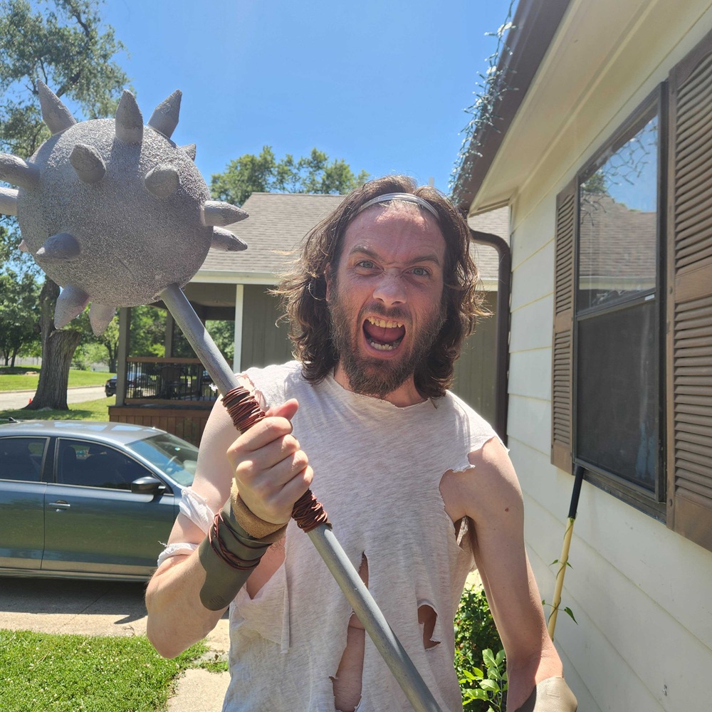
We’ve finally recovered from the afterglow of the Kellogg vs Booth Battle of the Bands last Saturday. Thanks to all those who joined us! It was a show that we won't forget any time soon!
There were performances from the legendary Captains of Industry, Order of the Phoenix, Rocket Pockets, and newcomers Rat Höle. The heroes of the night were the Captains of Industry, who stole the show and won the trophy with their amazing vocals and showmanship. See more in our latest Instagram post.
Thanks to Kellogg and Booth for letting us help sponsor the show!
West Coast friends: mark your calendars for Friday May 30th from 4pm to 6pm! We’re hosting a casual Founder’s and Friends meetup at Natoma Cabana in San Francisco. If you’re not too far from the Bay, come see us! We’d love to catch up and introduce you to some new founders!
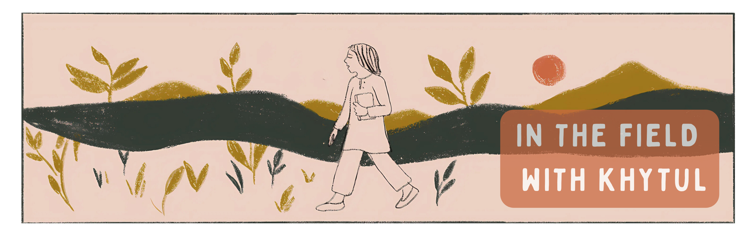
Art Showcase
Congrats to Khytul Abyad and Karoli Esparza, Department of Growth Art Fellows, for their poster designs chosen by Kellogg and Booth marketing teams! A huge thanks to Harry Master for helping to finalize the designs, as well as his design of DofG guitar picks for the Battle.

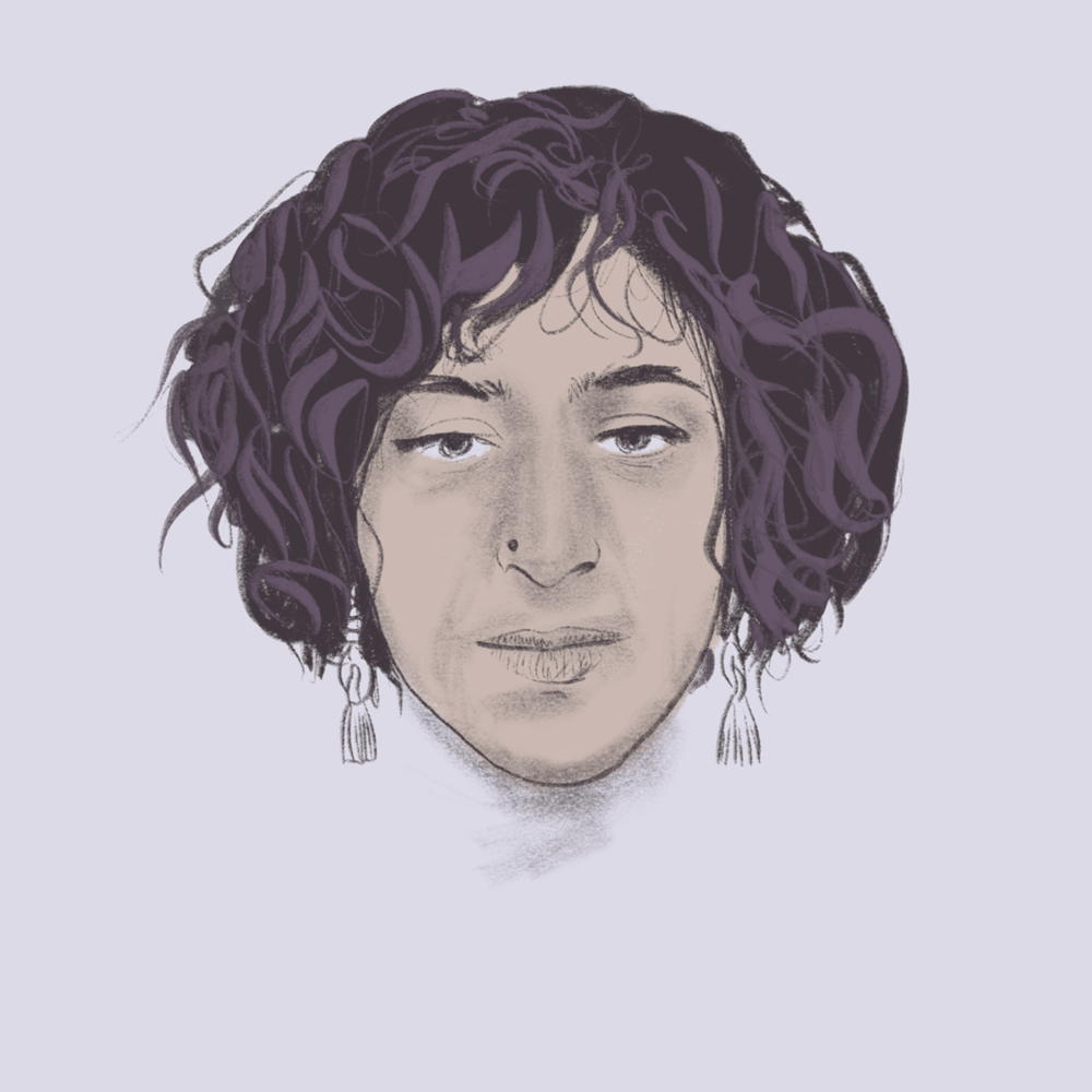
Poster Design by Khytul Qazi

Poster Design by Karoli Esparza

Guitar picks by Harry Master
Crafting a New Brand
In partnership with our client, BlockFills, we had the opportunity to write the next chapter of a premier brand.
The world of institutional crypto today is disconnected, and the platforms don’t exist to make it easy and safe for large traditional finance organizations to access these capital markets.
BlockFills presents a solution. Led by a team of veteran traders, and with aggregated liquidity and enterprise-grade tech, BlockFills is quickly becoming the choice for institutional trading of digital assets around the world.
In anticipation of a global campaign to build awareness and bridge the gap between TradFi and digital finance organizations, we helped rebrand BlockFills in a modern, tech-forward way. Thanks to an amazing new logo designed by Jesse Zoutewelle, we took the first step on this journey.

This logo combines a wordmark and an icon that nods to a main benefit of using BlockFills: with Blockfills, institutions can fill the biggest trades. Keeping true to BlockFills’ blockchain roots, we evolved the chainlinks from BlockFills' previous logo to become interactive block elements that flow from one to another.

Motion design (thanks to Tessa van Balen and Jordan McBarnett) further brings this to life with color filling in across the logo, just as the largest trades can be filled through the BlockFills platform.
We built several 3D models of this logo to power everything from visual effects for our film creative to interactive logo splines for BlockFills’ web properties (click here to experience it for yourself!).
We wanted to translate the logo from the screen to the real world. One physical example are the sandals designed by Jackie O’Kane, marketing manager at BlockFills, for the campaign launch in Dubai. The logo was molded in relief on the bottom of the flip flops… by the end of the night, BlockFills' blocks dotted the beachfront of the NAMMOS Resort at the Four Seasons Dubai.
Rethinking Identity
This logo is a part of a complete identity redesign, including new colors, fonts, a series of icons, and animation. After an analysis of BlockFills’ competitors and the crypto landscape, we choose colors reflective of safety and security, taking a page from how traditional finance organizations build trust among users.
We opted to use bold colors (bright blues and even Dutch Orange - wonder how that got on there, Jesse!) to promote BlockFills as an exciting tech brand and provider of trading software. We researched cultural associations of these colors to ensure that they would work in the many regions that BlockFills operates across the globe. Jesse also developed a beautiful color gradient which brings an aspect of fluidity and fun to the brand.


We chose a set of fonts that bridge the worlds of traditional and digital finance - including both serif and san-serif styles. We also utilized a modern, bold typeface and capitalization in the logo.

A series of arrow icons — reminiscent of the work of famous Dutch designer, Wim Crouwel — will help guide the user through BlockFills sales collateral. These have been animated for landing pages and the Blockfills website (currently under construction).
BlockFills is on the leading edge of an evolving industry, and we’ve been honored to help build a brand identity that will take it far into the future. Thank you to the BlockFills team for the opportunity to join them on this amazing ride.
Read on to hear more from creative director, Jesse Zoutewelle.
INTERVIEW
Meet The Department
In this edition of Meet The Department, we’re joined by our man near Amsterdam, Jesse.
Hi, I’m Jordan Roberts — your window around the world of our digital department. This week, I got the opportunity to get up close and personal with a master tastemaker and one of the driving forces behind our BlockFills campaign — Jesse Zoutewelle!

Thanks for meeting up to talk shop, Jesse! First off, where are you coming to us from?
I’m based in the Netherlands, in the beautiful city of Utrecht — known for its charming canals and historic buildings. It’s smaller than Amsterdam and much less touristy, which gives it a more relaxed, authentic vibe. I’ve been living here for over 10 years now. I originally came to study, and I never really left — it quickly felt like home.
Very serious question — If you could only eat one type of food forever, what would it be?
That’s a tough one — I love to cook and I’m a big fan of Japanese and Thai cuisine. But my true food obsession is Italian. Give me a perfect pasta, a wood-fired pizza, or a Florentine steak, and I’m in heaven. Honestly, I don’t think I could live without it.
With that, I'm ready for lunch. So, let’s get into some real meat. What jumps into your mind first when I say, “bad logos”?
Using Comic Sans as a wordmark. And worst of all — logos that look like they were made in five minutes and loved even less. Every brand deserves more than a sad font and broken dreams.
I shuddered down to the deepest parts of me when you mentioned Comic Sans wordmarks. What do you think are some of the most effective logos of all time?
One that stands out for me is Mastercard — it’s so simple, yet instantly recognizable. Those two overlapping circles say everything without trying too hard. That kind of clarity and confidence is what great logo design is all about, but there are so many out there that I like.
When you start work on branding, what are the first questions you ask yourself?
I start by asking: What does this brand need to communicate? What’s the core message we want people to feel, understand, and remember? Then I think about consistency — How can we express this identity clearly and cohesively across every touchpoint? From print to digital, internal culture to customer experience.

I also look for a strong metaphor — something that can inspire a visual language, a tone of voice, a style of motion and imagery. A brand isn’t just a logo — it’s shape, color, photography, typography, sound, movement. Every detail can strengthen the story.
And ultimately, I ask: How can we create something people are proud to work for again? Something that reconnects teams to purpose and energy. A good rebrand isn’t just cosmetic; it’s a reset — a chance to build meaning, pride, and momentum.
Your passion for this is absolutely palpable. I love it. How did you get into this line of work originally?
Inspiration has always been everywhere for me — in people, in nature, even during a commute. What drew me to this field was the excitement of starting with a blank canvas. There’s so much potential in that space — so many opportunities to create something meaningful, original, and inspiring. That possibility is what keeps me coming back.
Speaking of potential… if you had to choose one, would you be a ninja or pirate?
Right now, I’m reading a book to my oldest son about a babysitter who’s also a ninja! It’s only available in Dutch, but it’s a super funny book. If I had to choose, I’d definitely be the ninja.
Ninja vs pirate question was relevant! You, sir, have made my day.
Where else can people see your work?
You can check out my work on my website jesszoutewelle.com and on Behance: behance.net/jessezoutewelle.
Thanks for Tuning In!
Read the next Dispatch to see the film for the BlockFills campaign! Thanks for following along with The Department of Growth. You’re the reason that we’re here, and we appreciate you. And, if you're in the Bay on May 30th, don’t forget to join us for Founders & Friends!
In the meantime, for more content follow us on LinkedIn or Instagram or delve deeper into the Cultural Layer.
Related Articles